Brand identity 1R Apart Hotel — what our brand looks like.
Our main advantage is the place. That is why the O in the mark became a pin on the map standing next to the R. Twenty meters — and you are at the lift.
Logo
The mark and the logo with the name, in vector with a transparent background. Text in the files is converted to outlines — no font to install.




Colors
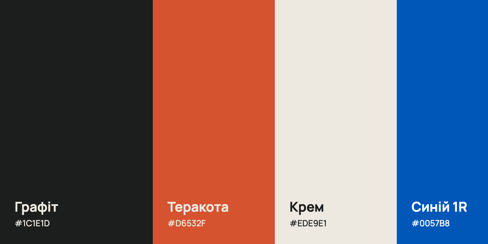
Three brand colors. Click a HEX to copy it.
- HEX
- RGB
- 28, 30, 29
- CMYK
- 0, 0, 3, 88
Primary. The mark, text, dark backgrounds.
- HEX
- RGB
- 214, 83, 47
- CMYK
- 0, 61, 78, 16
Accent. Warmth, evening, buttons and markers.
- HEX
- RGB
- 237, 233, 225
- CMYK
- 0, 2, 5, 7
Background. Light surfaces, the mark on dark.
Blue 1R — #0057B8. Only for the 1R lift marker in the logo, as on a road sign.
Typeface
Manrope — one typeface for everything: headings, text, logo. Free, with Cyrillic and Latin.
Light 300 — hotel in the logo
Regular 500 — headings and text
Bold 800 — Apart in the logo
АБВГҐДЕЄЖЗИІЇЙКЛМНОПРСТУФХЦЧШЩЬЮЯ
абвгґдеєжзиіїйклмнопрстуфхцчшщьюя
ABCDEFGHIJKLMNOPQRSTUVWXYZ 0123456789
How to use
A few rules so the mark looks the same everywhere.
Clear space
At least half the mark’s height around it, free of text and other elements.
Minimum size
The mark from 24 px, the logo with the name from 140 px wide.
Do not stretch
Scale proportionally only; do not rotate or tilt the mark.

Do not recolor
Only graphite, cream, terracotta or white. No gradients or shadows.
Need another format or version? Write to us: 1R@flamix.email